|
|
NOTE: ALL TEXT AND PHOTOGRAPHS ARE COPYRIGHT. All intending users please see our copyright notice page.
[picture in document]

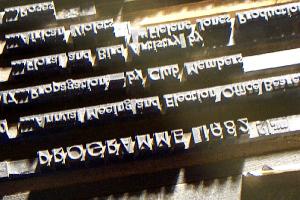
This closer shot shows the individual letters and spacing used in this document.
Note that some of the larger spacing pieces have lettering cast into their top surface. This will not print: it is too low. The piece just to the right of the top line (1982) has the legend: SB&Co 12 which indicates the manufacturer (Stephenson, Blake & Co) and the body size (12 points). It is a 12 x 24 quad.
Between each line in the setting is a strip of spacing. Typically these would be leads, but most or all of those in this example are wooden strips called reglets. Reglets are lower in height than the spacing used within the line. Spaces (used mainly between words) and quads (used mainly to quickly fill longer gaps) are around 12 points below the typeface. Leads are normally around that figure, but reglets are about 20 points below. Interestingly, some lines in this shot, where the text is very short, have been finished off with a piece of reglet instead of quadding the line with quads.
|
|
| What's your Interest? GO DIRECT FROM HERE OR USE OUR INDEXES BELOW |
Typography & Design__ |
D.T.P. or_ Word Proc |
Book___ History__ |
Media &_ Editing__ |
Self____ Printing |
Print___ Making_ |
Letterpress Freak____ |
|
Home___ Page____ |
Rejoin__ Tour__ |
Typo____ Glossary |
Museum___ Collections |
Museum__ Programs_ |
About the_ Museum__ |
Links__ Page__ |
Real Type Foundry_ |